amanda asher

Hi, I’m Amanda!
I'm a digital designer with an interest in user experience, actively seeking opportunities at the intersection of design and technology.I am passionate about design that works well and does good.Get in touch!
proceed

branding + identity
digital + print
Ground-up logo + identity design for a new small business in the beauty industry.
branding + web design
infographics
Ground-up brand identity + website design for a new small business in the event industry.

web design
print
A new website + proposal template for a consulting firm to reflect an evolving business model + services.
digital + print
Design for both digital + print mediums for a software testing platform.

branding + identity
A company-wide logo + identity refresh ahead of their 40th anniversary celebration.
digital + print
Print + digital design for a small business in the HVAC industry.

digital
Client communication email template design for a personal operation of newborn + family photography.
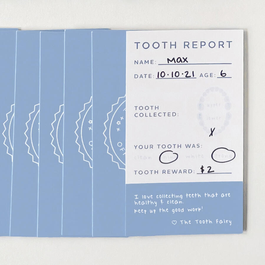
A mini card project designed as a fun way to commemorate lost teeth.
branding + identity
Ground-up logo + identity design for a new small business in the apparel industry.
product design
A research product dedicated to telemedicine + patient education.

DESIGNER.
MAMA.
GINGER.
OTHER THINGS.
Hi, I'm Amanda.I'm a digital designer and mama to two, currently based in Orlando, FL.My friends would describe me as a 'Jill of all trades'...and I'm not mad about it.I hail from the University of Michigan, where I earned my bachelor's and master's degrees.I love making beautiful things, and I'd love to make some beautiful things for you.Download my work sample below, and shoot me an email to get in touch.
branding + identity
digital + print
Honey Lash
Ground-up logo and identity design for a new small business in the beauty industry. Honey Lash’s primary logo is a simple wordmark with lots of movement in the script reminiscent of their primary aesthetic service—eyelash extensions.
This package included a full identity suite including business cards, service menus, client waivers, digital assets, social media templates, and more.


branding + web design
infographics
Pop the Soirée
A budding new business in the event decor industry needed complete branding + identity design from the ground up. The final logo design was created through an iterative process that explored the brand's inspirations while fine tuning the result.Once we had the brand identity, the next step was to establish a web presence with a new website designed from scratch. The site needed a solid homepage to work from and required pages to introduce the team, address FAQs, as well as a comprehensive pricing menu, which required custom infographics throughout.On top of the custom infographics, I also provided headshot and product photography as well as comprehensive photo editing throughout the image gallery. The final phase moved to some essential stationery and merch design to be used in day-to-day business operations.


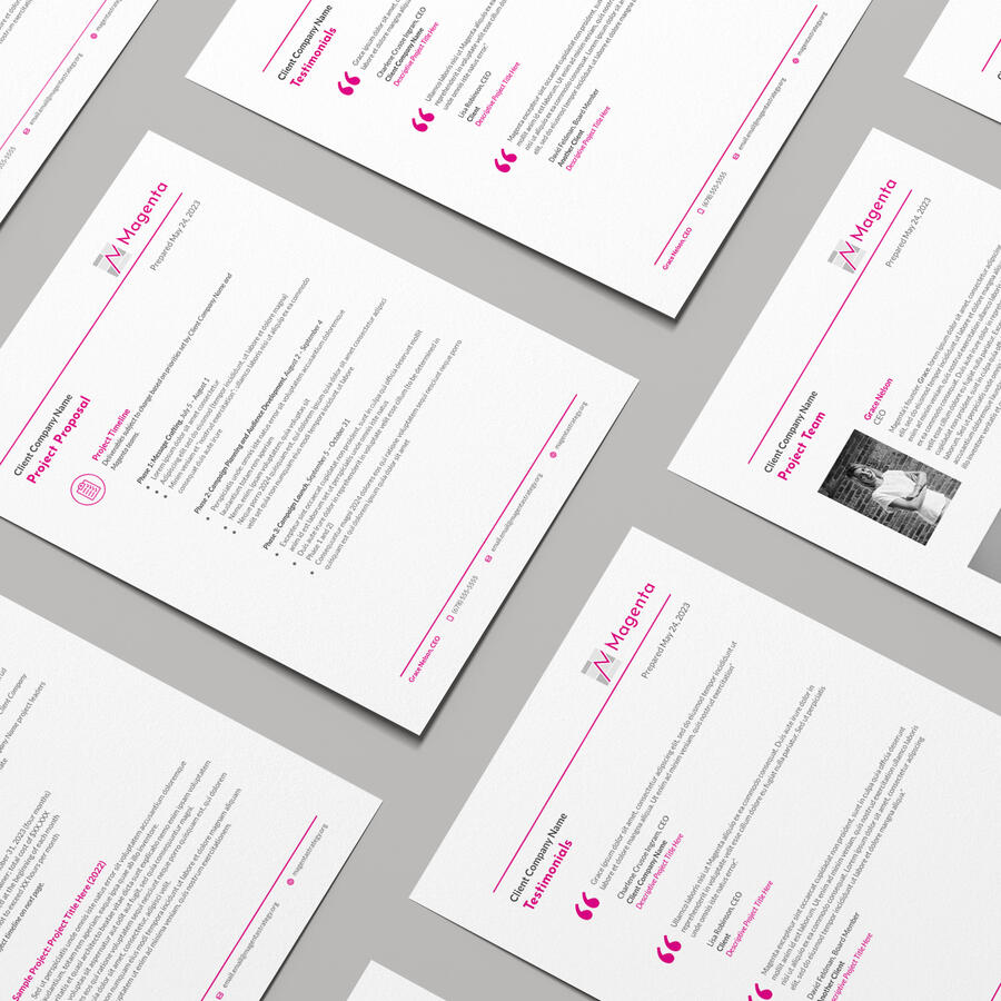
web design
print
Magenta Strategy
A consulting firm needed a new website to reflect an evolving business model and services. The new site needed to facilitate pages for their team as well as a catalog of case studies and publications to showcase for potential clients. Inspired by the magenta-colored GPS line used in airplane navigation systems, the design reflects a clean and minimalist layout with plenty of white space, allowing the magenta accents to breathe throughout.The next phase was to redesign their project proposal template to achieve consistent branding with the website. The new template is clean and scalable, allowing enough flexibility for any project or client.In collaboration with Lightboard.


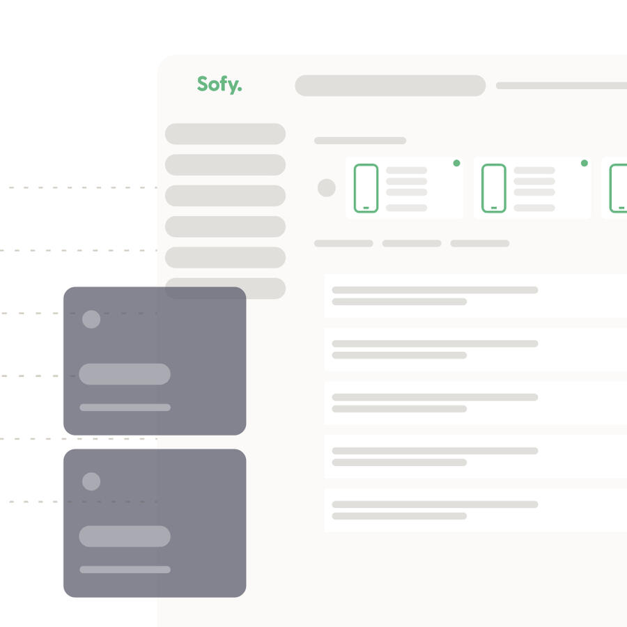
digital + print
Sofy
A variety of brand-supporting print + digital projects for a software testing platform client.The work spans various mediums and includes a variety of custom graphics. Starting with design for print, the marketing white paper design focuses on organization and legibility while incorporating on-brand custom graphics. Custom social media graphics and email signatures support brand consistency and recognition across digital channels. This client also requested a number of custom trade show graphics as part of booth staging, as well as custom product packaging to serve as marketing swag to show attendees.In collaboration with Lightboard.


branding + identity
Center for Computer Resources
A company-wide logo + identity refresh ahead of their 40th anniversary celebration, with the goal of modernizing while staying true to their roots. The new wordmark is a nod to the film and television titles of the early 1980s, bringing a retro-futuristic flavor to the table along with a reimagining of their original ‘handshake’ logo.This refresh package included the logo refresh, various digital assets including web + email, stationery, and merch design. The style guide was a solution to this client’s ongoing issues with brand consistency, and a successful educational tool in implementing and maintaining new brand standards.


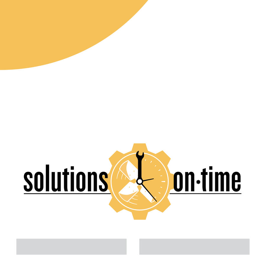
digital + print
Solutions on Time
This client requested a new website as they moved away from their previous hosting service. The re-design aims to place their logo front and center while simplifying and updating key information to make it as accessible as possible for their customers.This also included marketing collateral such as magnets and pocket flyers.


digital
Amanda Asher Photography
Client communication email template for a personal side operation of newborn + family photography.This template aims to give spotlight to a preview of the client album while remaining minimal yet playful with the layered script.

Personal Project
Designed for print media, these mini cards were designed as a fun way to commemorate visits from the Tooth Fairy.The 14pt paper stock was selected for its silky matte finish. The surface readily accepts ink or pencil as a means of documenting the details of each tooth “collected”. The front design is accentuated with an eye catching raised gloss finish.


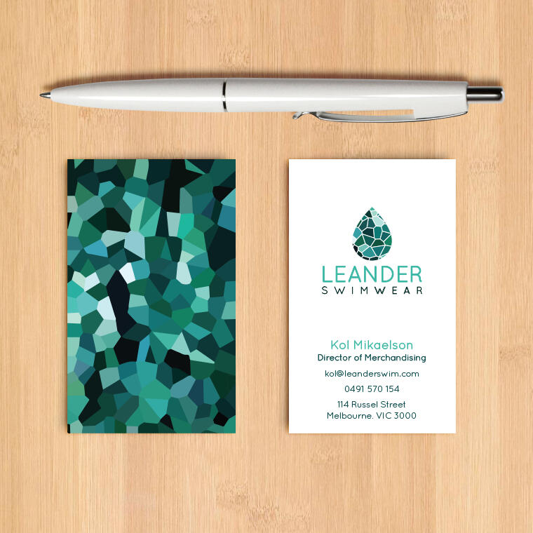
branding + identity
Leander Swimwear
Ground-up logo and identity design for a new small business in the apparel industry.
The logo takes influence from the color distortion that happens underwater, and the outdoorsy nature of the client’s customer base. The pattern takes inspiration from the tessellation of a sea turtle’s back.
This package included a full branding suite including business cards, stationery, retail packaging, digital assets for email + social media + mobile retail product, and more.


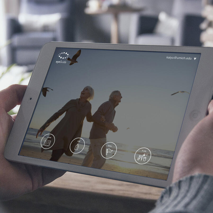
product design
eyeGuide Application
This was a research product dedicated to telemedicine and patient education. I was an information + graphic designer as part of a research team of twelve made up of ophthalmologists, medical researchers, back-end developers, and one other designer.
The goal was to help patients stay on top of their medication regimens by both explaining and simplifying their doctor’s instructions. My role was largely in digital content production, including infographics, digital assets, photography + photo editing, video editing, as well as wireframing, prototyping, and testing.

